widget dag
2026-07-22
git-scraping is awesome. It let's you re-use CI as a pattern to scrape data from the internet and store it publicly in your repository. Here's an example:
name: scrape
on:
  schedule:
    - cron: '0 * * * *'   # hourly
  workflow_dispatch:
permissions:
  contents: write         # needed to push the data back
jobs:
  scrape:
    runs-on: ubuntu-latest
    steps:
      - uses: actions/checkout@v4
      - run: curl -s https://example.com/data.json > data.json
      - run: |
          git config user.name "Automated"
          git config user.email "actions@users.noreply.github.com"
          git add -A
          git commit -m "Latest data: $(date -u)" || exit 0
          git push
The best part of this is that you only need Git. Everyone already has access to Git. And it also means that everyone can have access to important analytics. No need to add another tool! Not to mention the fact that integrating with a GitHub account is dead simple compared to integrating with any analytics tool.
One small tip if you do this at a company: don't forget about the permission flag. At some point security will, rightfully, be hardened. And you typically don't want CI jobs to make extra merge requests to your repo. So you'll need to do this:
name: scrape
on:
  schedule:
    - cron: '0 * * * *'
  workflow_dispatch:
permissions:
  contents: write         # this part!
jobs:
  scrape:
    runs-on: ubuntu-latest
    steps:
      - uses: actions/checkout@v4
      - run: curl -s https://example.com/data.json > data.json
      - run: |
          git config user.name "Automated"
          git config user.email "actions@users.noreply.github.com"
          git add -A
          git commit -m "Latest data: $(date -u)" || exit 0
          git push
Without that permission, jobs may fail in the future.
I was working with an agent to produce a new widget. I gave it a research task, gave it a direction, and when it came back I immediately stopped prompting it further to investigate what it did. The artifact that was generated wasn't merely functional, it did something that I did not understand and was therefore worthy of study.
It's an important moment that people show not ignore. But to help explain the situation, try playing with the widget below:
Drag left/right to scrub a value. Works for touch, mouse, and pen.
f(0) = ?
That's interesting, right? It feels like you're able to interact with Latex on the web. But how does this work? Mathjax puts the entire rendered latex in a single <svg> element. So that's impossible to bind events on that, even in hindsight.
So how does the widget work?
The trick is to use a small, nearly hidden, feature of katex instead.
$$ f(x) = \frac{1}{\sigma\sqrt{2\pi}} e^{\frac{(x - \mu)^2}{2\sigma}} $$
See that math, this is the latex that generated it.
$$ f(x) = \frac{1}{\sigma\sqrt{2\pi}} e^{\frac{(x - \mu)^2}{2\sigma}} $$
But in Katex you're able to add more information! You could do something like below around $e$.
\htmlData{param=mu}{e}
This isn't standard latex, and it requires adding some extra katex settings.
katex.render(expandTemplate(), host, {
  displayMode: true,
  throwOnError: true,
  trust: (ctx) => ctx.command === "\\htmlData",
  strict: (err) => (err === "htmlExtension" ? "ignore" : "warn"),
});
Now, if you look at how $e$ is actually rendered, you'll notice this:
<span class="enclosing mtight" data-param="mu">
    <span class="mord mtight">e</span>
</span>
See that? Two things:
span instead of everything in a single svgTo be clear, I used an agent to build this widget. But while it was clanking I took a moment to step back and to recognize that the generated code was worthy of study. It was a moment worthy of pause.
Not because the coding quality was amazing, but because it reveiled a pattern that I was completely unaware of. And understanding that pattern is going to help me longer term.
It's allmost like the coding agents makes you a wizard but you still need to understand what spells you're able to cast. And after doing a small deep dive, by recognizing that something was worthy of study, it feels like I gained a new spell that I can cast in the future. You can do a lot of cool things with maths/animations using this API!
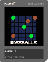
Found a little gem on Reddit.

I been toying with a tiny game made with PICO-8. You can play it below.
Few fun facts about it.
You can also download the cartridge if you want to play on your own device locally.
Lucide is a fantastic resource for icons. Just wanted to make a note for myself because I keep forgetting the name.
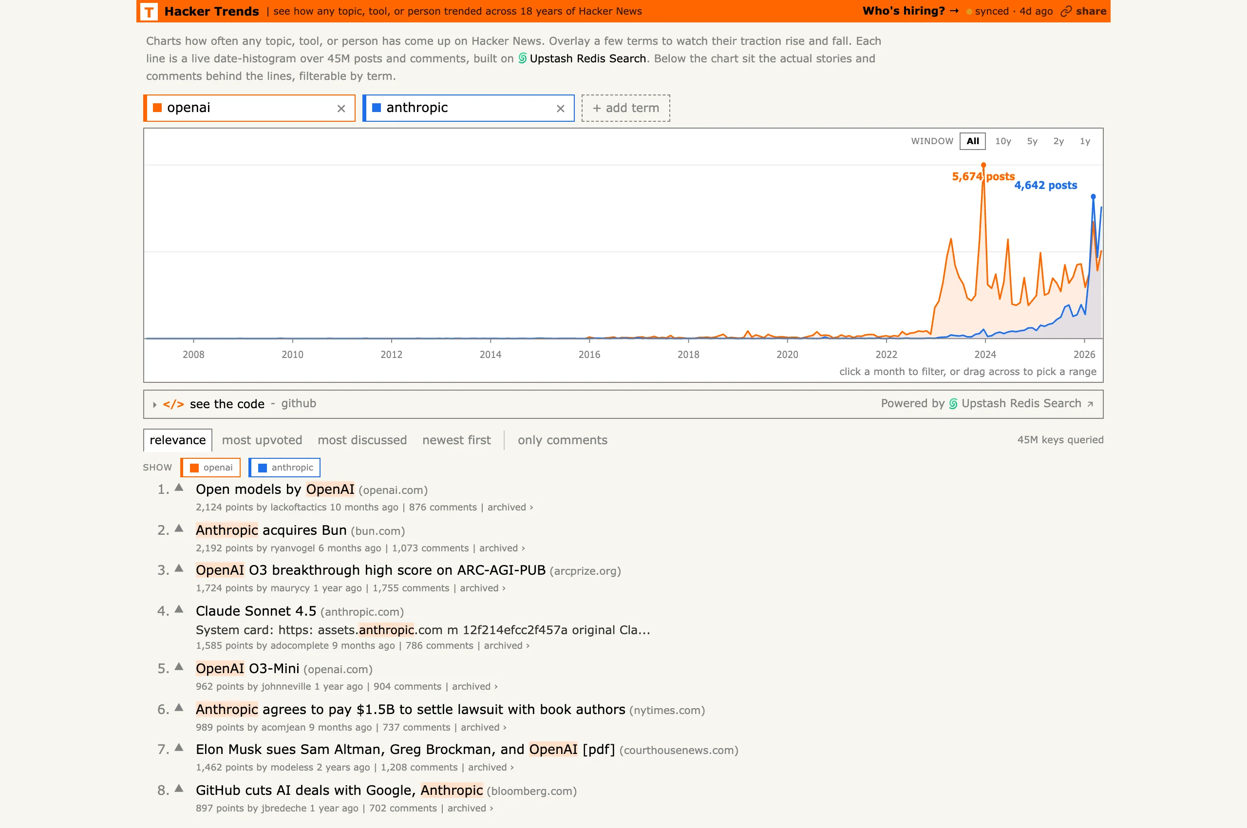
Someone made Google Trends for Hacker News by indexing 18 years of comments. The tool lives at hackernewstrends.com and lets you overlay how often terms show up over time. Mostly bookmarking this for myself, but it's a fun way to confirm hunches about when a topic actually took off.
A Billboard chart headline made the rounds: "Olivia Rodrigo becomes the first woman in history to debut her first ten top 10 Hot 100 hits in the top 10."
Lynn quote-posted it a theorem that certainly made me giggle.
A hit song on the Billboard 100 charts is termed $k$-good if it is ever in a weekly top-$k$, and $k$-immediate if it debuts in the top-$k$. An artist is $(n,k)$-Olivian if their $n$ first $k$-good hits are all also $k$-immediate.
Headline 1. Olivia Rodrigo is the first $(10,10)$-Olivian woman.
I made this YouTube video the other day about how all code, eventually, is abandoned. It doesn't die, because it still exists, but it simply won't have people working on it anymore.
But there's one thing that can prevent it, the code can graduate! It can be that you had an idea so useful that another project, a much larger one, will grab it to run with it.
It's happened twice to me. A few widgets from wigglystuff just got ported to marimo just like how a few scikit-lego components (or at least their spirit) have found their way into scikit-learn.
I wish it could happen to more people because this kind of pollination across projects is exactly what keeps the creativity alive.
